Wednesday, 11 December 2013

Panoramic Layering (Photography)

Using Photoshop I manipulated many images that I then layered to make a digital panoramic image.

The reason I like this image that i manipulated is because I think that the different images merge well into the main subject of the image and create a unique look. I also like the way the small old building contrasts in style with the main modern building.

I personally like this panoramic image as it is simple yet effective with the use of the same image layered onto one another. i like the arched effect each image gives to the next, this creates an ongoing look to the image.


The reason I like the effect this digital edit has given me is because of the both panoramic and double exposure effect it gives. The contrast between architecture and sculpture i find really interesting, even more so when the two are merged together with the use of effects, this creates a busy scene with lots of content which i think captures the audience.

Double Exposure Editing Using Photoshop

Using Photoshop I manipulated these images by layering different images of one subject. To do this I changed the opacity of the images to make them over lap to create double exposure.
This manipulation I really like because it gives the impression of zooming in and out, almost a panoramic view of the arch way. The final outcome to this image worked really well because it is complex to look at as the original image is not obviously seen.

This image is very complex in composion as I used multiple views of the subject matter, which I think works exceptionally well. This was successful because the use of many layers of the same image creates an overall subject matter to the whole area of the image and not just the main obvious subject matter alone as one structure.

This image worked really well as it has good composition and is effective due to the complex manipulations. i like the sense of movement within this picture as the repeat of the same person creates a kind of ghostlike look.

Wednesday, 4 December 2013

Still Life Editing Using Photoshop (Graphics)

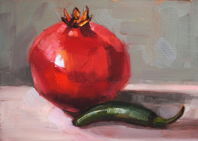
I have chosen an original painting that i have then used to digitally copy.
Original Still Life Painting.


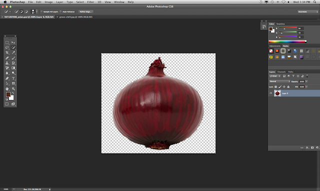
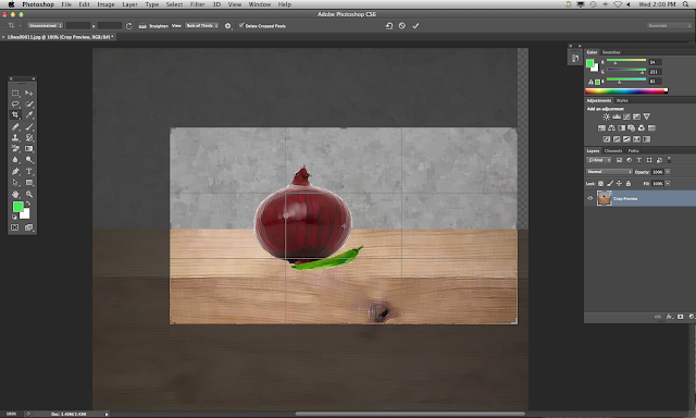
firstly I layered my starting images so that i could then use the "quick selection tool" to remove the background of the image.


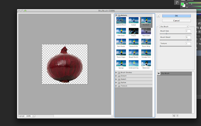
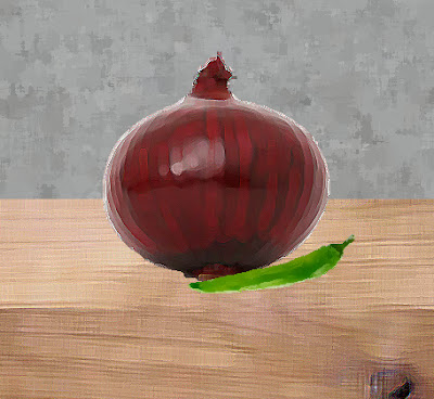
I then selected the image and used the "filter gallery" tool and used the "paint daubs effect" and then changed the bush size, sharpness and brush type.
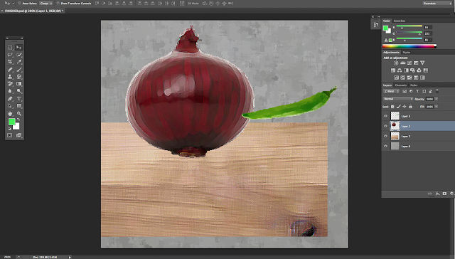
After editing all the different items of the image i duplicated them onto one window and started to structure them so that they layered in the correct order.
Then using the crop tool i cropped the image so that it was the appropriate size that was adequate for the original copy.
I then made sure that everything was in the correct place as the original painting.


Finished digital copy.

Evaluation
Creating this digital copy of a still life painting, I found very challenging. The reason as to why I found this challenging was because I had never used Photoshop before, so using the different tools and learning the short-cuts became very complicated and difficult to remember. When I finally got to grips with the tools of Photoshop I found the effects very impressive, they allowed me to create different texture and tone within my work. My strengths that I found while using Photoshop was that I was able to get the effect I hoped to achieve very quickly. Personally I would say that my weakness was that throughout making my digital copy I had open many images to edit so at times I was confused and I often lost track of which parts of work I was working on, due to this I know know that I can organise my different windows of work on tabs in Photoshop. Although I enjoyed creating this digital copy of a still life painting, my finial outcome was not as successful as I'd have hoped for it to be, the reason for this was because I was new to Photoshop and I think that if I was to do another piece similar to this I think that I would be able to work at a faster pace which I could then involve more time with effects, as I had to work to a deadline with this piece so unfortunately I was restricted the amount of time I took choosing the right effects and the structure of the whole piece. Overall I enjoyed learning how to create this piece of work and understand my errors that I need to correct for the next time I digitally copy a painting or use Photoshop in any way.


Wednesday, 27 November 2013

Double Exposure on Film

Double exposure using film.
Using a film camera we visited local well known buildings within my local area, both outdoors and indoors.

I really like the splitting effect on this image as it gives a contrasts and almost splits the image into two.

This particular image is very interesting as it has good light qualities within sections of the image, which I think works really well.

This image has a very busy look as there are many things happening within this image which speaks a lot about the place in which the photos where taken.

I don't think these two images worked as well as the rest, as I don't think the two images merged together well enough to create an interesting composition. 


The boldness of the building in this image creates a deep look to this photograph which is really effective.

The two images have merged really well to create a good composition and good contrast between the two images.


These two images are effective because they are different from the others which were taken outside although one of the images merges together both indoors and outdoors.

Townscape Photographer Research

Townscape Photographer Research

Henri Cartier-Bresson

In the 1930s, Henri Cartier-Bresson abandoned an aspiration to paint and picked up a camera instead. During this time, he flirted with the ideals of the surrealist movement and it was his great insight that the Leica — a hand-held camera with a blink-of-an-eye shutter — was an ideal instrument with which to capture, in an instant, the kinds of imagery that the surrealists strove for.


The reason I chose this photographer as I love the composition of his work as the whole subject matter covers the whole space within the photograph, I also like the minimal use of colour across all his work.

Alvin Coburn

Coburn enjoyed experimenting with the printing process and spent some years creating his own inks and trying out different grades of paper for the best effect.
His technique of changing the perspective of a scene by pointing the camera down created images that had no horizon and so created a more abstract image.


The reason I chose this photographer to influence my own photography was because I find the use of the almost blurred sections within his use of images, his manipulations using layering are also very interesting which also gave me the idea to in operate digital manipulation into my townscape photography.

Alfred Stieflitz


Alfred Stieglitz was always interested in photography as an art form. He was also interested in the technical boundaries of photography.


This photographers work I found interesting because of his use of limited colour within his work, I also found that all his work have a cold dull feel to them which I think works really well.

Double Exposure Photographers

Idris Khan
London-based Idris Khan is best known for dense and beguiling photographic images which he creates by re-photographing or scanning and digitally overlaying entire series of existing printed works into single composite prints. By carefully calibrating the opacity of each layer and optimizing incidental details, Khan’s digital composites buzz with traces of their component images. 


The reason why I chose to in coperate this photographer into my work was because I love the way his work looks almost like a detailed line drawing. It also has the look of movement, as if the subject matters are vibrating which i think is a really effective. 

Wednesday, 6 November 2013

Townscape Own Photography

Photographing my own townscape images using different shutter speeds to capture different effects. Some were taken inside and outside my local area, I choose these particular compositions as i wanted to achieve both simple and effective images.

Wednesday, 16 October 2013

Still Life Editing Using Photoshop

Effects using Photoshop by editing my original still life photographs.

For this photograph I decided to experiment using filters to create effects that I found interesting.

For this photograph I used the 'liquify' and 'solarise' filter in Photoshop, I chose these effects because I think they are really effective towards the subject of the image.

Original image

Edited image


For this image I manipulated it by using layers. Firstly I duplicated the background layer and then used the blend mode 'difference' effect to give it an effective transparent look. I then moved this layer so that it created a double subject image.

Original image
Edited image

Editing Photography Examples


Still Life Group Photography

During the first session of photography we worked in groups experimenting with shutter speed using still life objects. Taking the photographs in the classroom and then experimenting further by taking the objects outside, this was effective because of natural light that made the images taken have more depth and the natural environment helped with the placing of the objects.

From the photographs we took, these are a few of my favorite photographs.